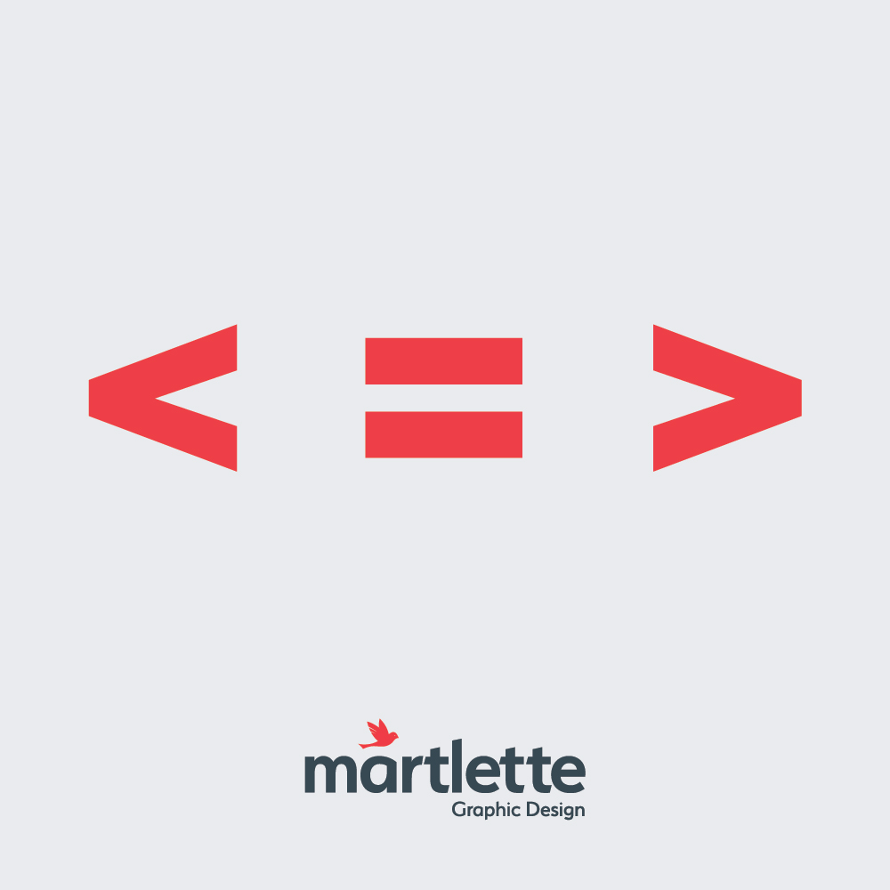
Your audience only has so much time and attention to dedicate to your brochure, website, poster or marketing collateral. Whether your graphic design is creating your print ad designs, stationary or or business brochure, less is ALWAYS more. Your message and brand design needs to clean and pack some punch to get noticed and the way to do this is “keep it simple”.
It can be tempting to cram every piece of information you have on product or service onto one page or into one brochure, but will anyone ever read all of it? Are you actually distracting your audience from the real message you are trying to communicate?
A simple design that leaves “room to breath” is way more attractive to the eye than a busy cluttered design. When working with Martlette Graphic Designers, you will hear us talk with you about “clean” and “fresh” design or “allowing for white space” which gives our designs appeal to your audience, encouraging them to read your brochure or website and find out more. We work with you to communicate your brand in a clear and concise manner, that speaks volumes about your product or service through compelling design.
We at Martlette want your target audience to understand your key message as soon as they see your professionally designed materials. We ensure that our graphic design solutions do not clutter your message with too many colours, unnecessary design elements, large blocks of text or low quality imagery that will only distract or lose the reader’s interest.
View some examples of our recent work to see how your business could benefit from working with the graphic designers at Martlette in Geelong.

