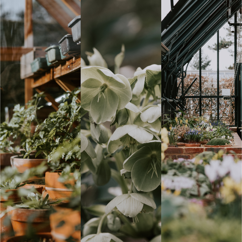
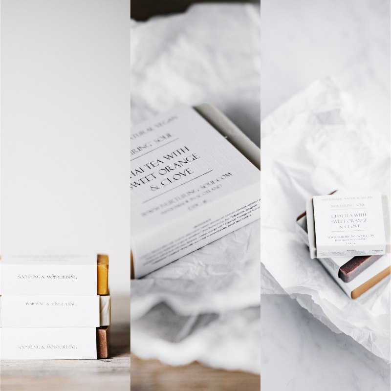
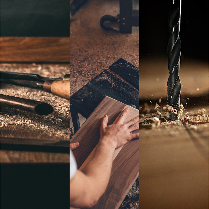
Selecting the right images for your website is a must. That’s why it’s important to set aside time and money to ensure you make suitable choices.
Like a shopfront, your website can be the first point of contact between your business and a potential customer or client. Making a good impression from the beginning is essential.
It goes without saying, photos or graphics used on your site should be of high standard and look professional. Don’t try saving money by taking photos yourself or creating your own graphics unless you have excellent camera skills and a creative eye.
Ideally, commissioning a professional photographer can provide you with perfect pictures for your site. However, this is not always feasible or affordable. There are other options but take on board reliable advice to ensure your site looks top notch.
Here are a few key pointers to make sure your website images are worthy.
Keep images relevant
Images on your website should be relevant to your business, location and customers.
- Use photos or graphics which best reflect the products or services offered by your business or organisation.
- Images should support the copy (written information) on your site and be relevant to the subject matter on each page.
- It can be fun to use cute, quirky or humorous images but make sure they are appropriate for your organisation and are unlikely to be misinterpreted as flippant or offensive.

Avoid overusing stock images
Stock images can be a handy option. However, don’t fall into a trap of overusing stock photos.
- When searching for stock images, avoid ‘popular’ images which already widely appear on the internet or in print media. Instead, look for the latest uploads for a fresher feel.
- If using stock images of people, ensure the images feature people of ages and backgrounds which reflect your own customer or client base. Never use stock images to represent your staff.
- Talk with your graphic designer about customising a stock photo or graphic by adding other design elements to the image.

Maintain a consistent style
Your website’s images should reflect the culture and image of your business or organisation.
- Introduce a theme for your images, whether it is a specific colour scheme or a graphical style. Mismatched imagery can look messy.
- Use consistent dimensions and similarly cropped images across your website. From the start, choose whether you prefer square images or whether you favour portrait or landscape photos and graphics.
And, remember, talk it over with your web developer and professional graphic designer. They are likely to have access to a variety of resources to help you pinpoint the images that fit the look and feel of your website.


